Whichever side you fall on is fine. The best thing is to be consistent. A set background that you use for all your photos helps to brand your shop. Or if all your photographs are shot with a plain white background, that will also define a type of brand.
One good way to ensure that you have a uniform background for all your product photos is to purchase a yard or two of fabric. You can pick whatever neutral color you'd like, and then you can throw that over whatever table you're photographing on.
But the best way to see what you prefer is to look at some examples. First up, some examples of plain backgrounds:
Let's start with supplies. When you're selling something that someone's going to use to make something else, we really want to get a good look at it. Close up and plain background is great for this.
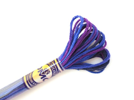 |
| DMC 4245 Variegated 6 Strand Floss Mystical Midnight from Ancora Crafts |
This little critter does well against a plain background...
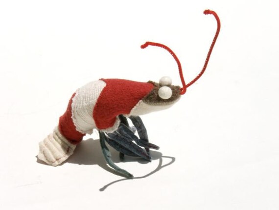 |
| Sweater Scrap Prawn by Zazu Faure |
And a plain background doesn't have to be white. The dark background helps make this silver necklace pop.
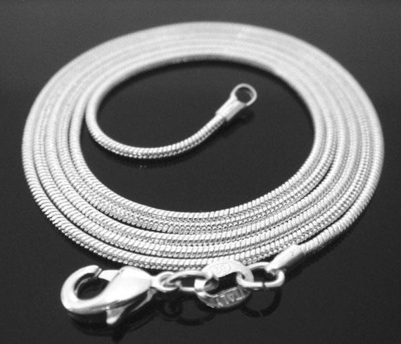 |
| 30 inch .925 sterling silver 1mm snake chain necklace by Designs by Tami |
Next, here are sellers that have more scenery behind their products:
Hollow Books' photos all seem to have this background. It makes it really easy to spot their products, especially in a random search.
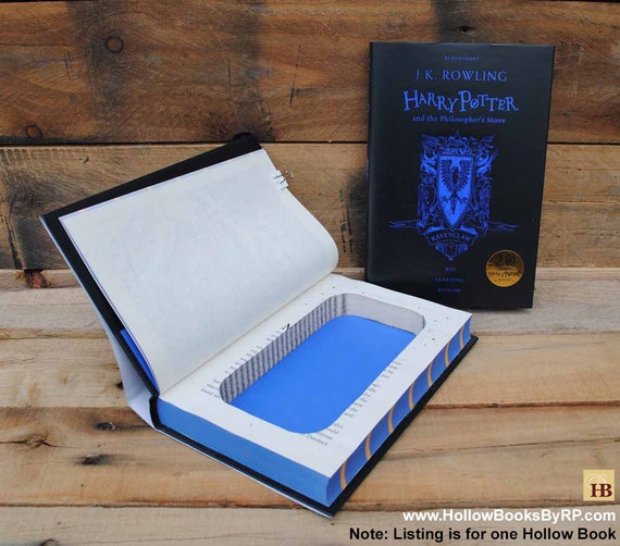 |
| Book Safe - Ravenclaw Harry Potter by Hollow Books by Refined Pallet |
Here's a different way to showcase a pair of earrings--with a map for the background...
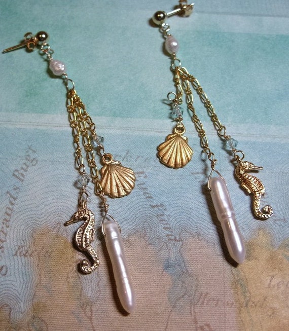 |
| Sealife earrings by jewelry N gemstones |
And if you're showing off an item that can be worn, having a model is great. We can really see this product in use and imagine wearing it ourselves.
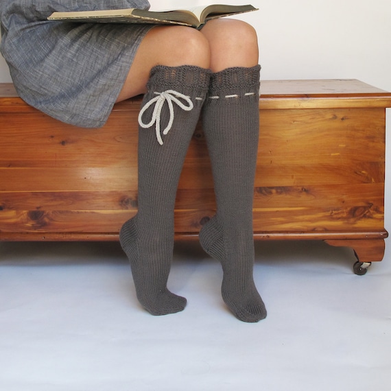 |
| Knee High Socks by pink candy studio |
If these were your products, would you have chosen to shoot them against a different background? What sort of background do you prefer in your photos?

No comments:
Post a Comment
Thank you for stopping by. We love to hear from you.
.