The California Crafters Club of Etsy (CCCOE) is a group of independent artists, crafters, & artisans from California who sell their wares on Etsy.com.

Thursday, September 27, 2018

Target the Long Tail Keywords

One of the things that popped up in Etsy's new search guide was "do target 'long tail' keywords". Which we've all been doing already, right?

No? What is a "long tail" keyword? Ahem...

Let's pretend we're in a big box store, ambling about. We have no specific destination in mind. We're just killing time. But then we notice the bedding section.

Hey, you think, I could really use a replacement set of sheets.

So, you head over and walk up and down the aisles. And as you peruse, you think. It's fall. The weather's turning cooler. A warmer set of sheets, like flannel, might be what you need. You head towards the flannel sets, and you look for queen size as that's what's going to fit your bed.

What color? Do you want a print? Thread count? As you look, you narrow down what kind of sheet set you want.

If you were to look online, at this point you wouldn't search "bed sheets". No. Your query would be something along the lines of "flannel bed sheets queen size" with color indicated and maybe thread count.

That's a "long tail" keyword. You pretty much know what you want, so you can be fairly specific in the search. And you're pretty much ready to buy.

This is what we want to target when finding tags. We want to end up in the search by the buyer who is ready to buy and pretty much knows what they want. This means being very specific in your tags.

So, let's take a look at this bag from annie k designs:
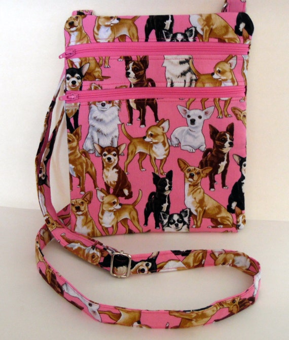
image 0
Chihuahua Hipster Bag

Who's going to want this bag? A dog lover, preferrably one who loves chihuahuas. Someone who's looking for a purse and wants a crossbody one. 

A good long tail keyword for this might be "pink chihuahua crossbody bag". Obviously, this won't fit in one tag as it's way longer than 20 characters. But "pink" should be one of the attributes (which will show up in Etsy search). And "chihuahua" and "crossbody bag" will both work as tags. 

(While they didn't come out and say it, the new guide hinted that exact phrase matches in the title and tags weren't as vital as in the past, so if "bag" is used once in the tags, it doesn't have to be repeated.)

Have you been targeting long tail keywords?

Monday, September 24, 2018

Search Updates

Etsy just released a new search guide. We need to pay attention.

When Etsy updates their search guide, that means that they've adjusted the algorithm their search uses in evaluating listings. So, we need to look at our listings to make sure that we've optimized them so that they can take advantage of these updates.

Marmalead's blog noted three big takeaways from the new guide: title length, renewing listings, and long tail keywords.

The new guide says that of the 140 characters available for titles, it's fine not to use all of them. Your title should be readable by a human. Much of what I wrote three weeks ago still holds. Combine tags into a naturally sounding specific description of your item. Only now there's no need to "tag stuff" your title. Two or three phrases that describe your listing will suffice.

As for renewing listings, it's no longer going to give your listings the bump it once did. The goal is to make your listings more searchable in the long term. This is good news as we no longer need to worry about the cost of frequent renewing. (Although, that might not be entirely accurate.)

Long tail keywords we'll talk about in a later post.

There were a few other takeaways I noticed in the new guide (that hopefully aren't surprising to you):

  1. Categories and attributes are important. They act like tags in search and will help direct buyers to your items if that's what they are searching for.
  2. Have you ever considered using a tag with a misspelled word in case buyers are misspelling in the search bar? Don't. Etsy corrects misspellings from searchers and directs them to the correctly spelled tags.
  3. Make sure your About section is filled out as well as your shop policies. When determining ranking (how high your item shows in a relevant search), a shop with an About section and shop policies will rank higher than one that doesn't. 
  4. Consider free shipping. This is going to be more relevant going forward. (Hint: raise the price of your item by the amount it's going to cost to ship, and then call the shipping "free".)
  5. Only choose occasion for things specifically for that occasion (such as Christmas stockings for Christmas). But, feel free to use a tag if your item can be used for that occasion ("Christmas gift" tag).
The good news is, not much has really changed. If you've been keeping to good SEO practices up until now, you probably don't need to make any drastic changes. And this is a good opportunity to refresh your listings (which you should be doing seasonally, anyway). 

What changes have you noticed in the new search guide?

Friday, September 21, 2018

In the Background

There is a bit of a debate over backgrounds in listing photographs. Some say that backgrounds should be plain so that your item is the center of attention. Others say that a photo needs something in the background or it's too plain.

Whichever side you fall on is fine. The best thing is to be consistent. A set background that you use for all your photos helps to brand your shop. Or if all your photographs are shot with a plain white background, that will also define a type of brand.

One good way to ensure that you have a uniform background for all your product photos is to purchase a yard or two of fabric. You can pick whatever neutral color you'd like, and then you can throw that over whatever table you're photographing on.

But the best way to see what you prefer is to look at some examples. First up, some examples of plain backgrounds:

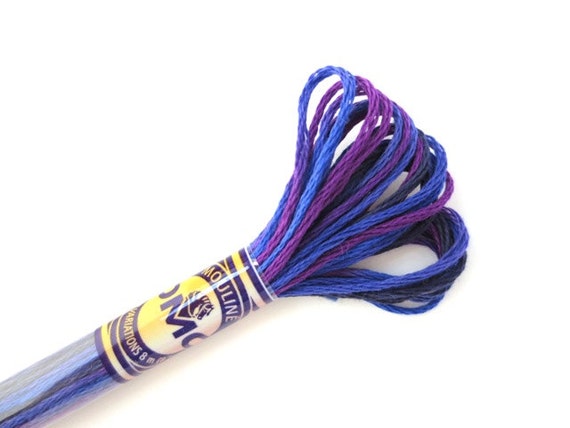
Let's start with supplies. When you're selling something that someone's going to use to make something else, we really want to get a good look at it. Close up and plain background is great for this.

image 0
DMC 4245 Variegated 6 Strand Floss Mystical Midnight from Ancora Crafts

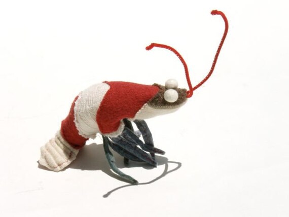
This little critter does well against a plain background...

image 0
Sweater Scrap Prawn by Zazu Faure

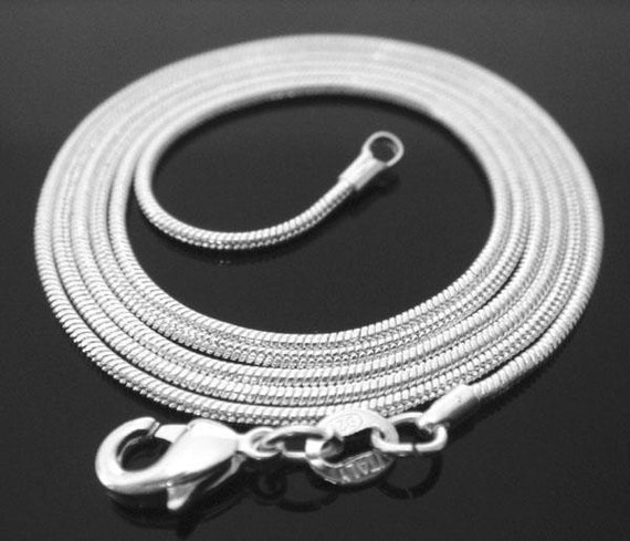
And a plain background doesn't have to be white. The dark background helps make this silver necklace pop.

image 0
30 inch .925 sterling silver 1mm snake chain necklace by Designs by Tami

Next, here are sellers that have more scenery behind their products:

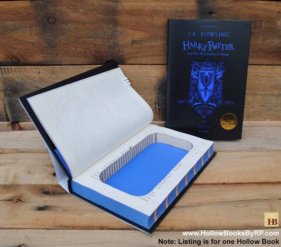
Hollow Books' photos all seem to have this background. It makes it really easy to spot their products, especially in a random search.

image 0
Book Safe - Ravenclaw Harry Potter by Hollow Books by Refined Pallet 

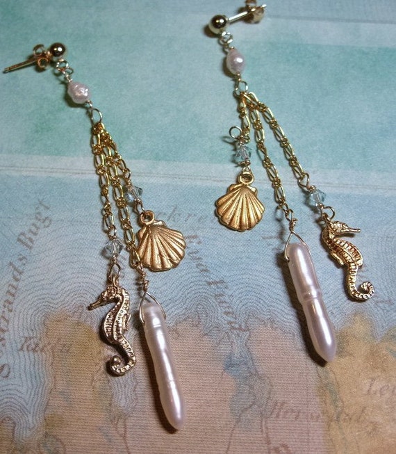
Here's a different way to showcase a pair of earrings--with a map for the background...

image 0
Sealife earrings by jewelry N gemstones

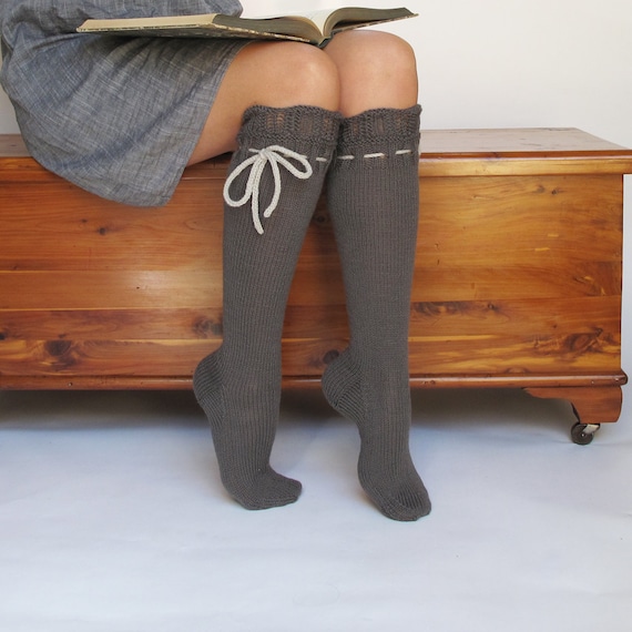
And if you're showing off an item that can be worn, having a model is great. We can really see this product in use and imagine wearing it ourselves.

image 0
Knee High Socks by pink candy studio

If these were your products, would you have chosen to shoot them against a different background? What sort of background do you prefer in your photos? 

Tuesday, September 18, 2018

Shine a Light on It

There's a whole lot that goes into taking a "good" photograph. There are high school and college courses designed to develop students into competent professionals.

If you are deficient in this area, you might want to look into taking a class. However, there are a few things you can do right away to make your pictures better. And the more you practice, the better you're going to get.

A big thing is to take care of your lighting. Your photographs should be well-lit. Or, at least, deliberately lit. There are articles (and probably books) all about how to light photographs well. Today I can only scratch the surface. Here are three articles to get you started:

The best lighting is natural light. Sunlight. However, direct sunlight can be too much, especially the harsh sunlight of high noon. You want the sunlight filtered a bit, depending.

But not everyone can take pictures outdoors. And not everyone has a good place indoors that gets good sunlight. When looking into lighting options, look for white light. Lightboxes can also be helpful. And multiple sources of light can help to make a photograph pop.

(Yes, there's a lot that goes into getting good lighting. Take lots of pictures. See what works. That's the best way to get better pictures.)

Here are some photos from team members that show what you can do with lighting:

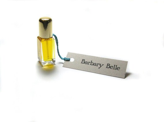
First up, this photo looks like it was photographed in a lightbox. It gives a very plain background so what you see is the product. Nothing else distracts.

image 0
Barbary Belle Perfume Oil by Scent by the Sea

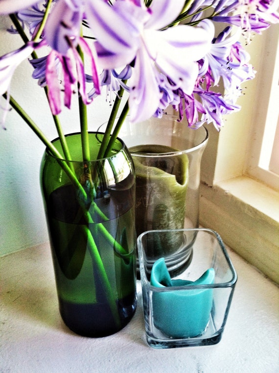
Here's a picture where natural light was used. See the window? It gives a bit more drama to the shot, highlighting how the vase will look in use.

image 0
One Upcycled 1.5L Glass Wine Bottle Vase by Bottles & Wood

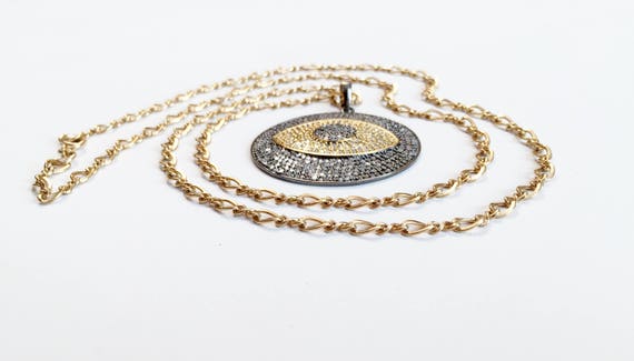
Here's an example with flood lighting. We can really see the necklace, and in a piece like this, we want to see detail. We can.

image 0
Large Pave Diamond Evil Eye Medallion by Mooti Designs

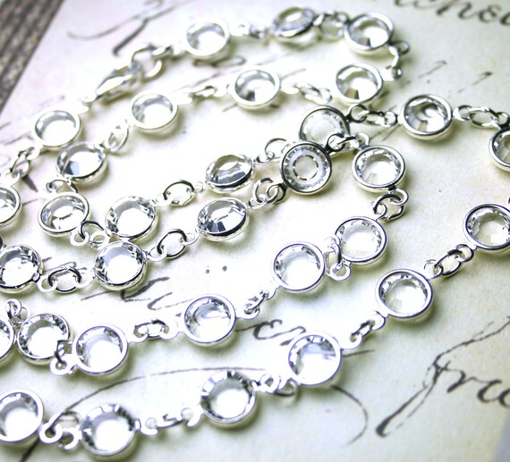
The brightness of the light helps these crystals shine. When we're shopping for jewelry, we really want to see it sparkle. This sparkles.

image 0
The Perfect Crystal Necklace by Beaded Treasure by Sue

There are many ways to do lighting. There are many ways to get it right. How confident are you in your photos' lighting?

Thursday, September 13, 2018

Keeping Your Focus

When it comes to selecting pictures to use in your listings, there are a lot of things that should be obvious. But, if you take a look on Etsy, you will find listings which have pictures that aren't all that great. So, it's time to state some things plainly.

All your listing photos should be in focus.

The best way to ensure that you don't make this error is to take a lot of pictures when photographing your items. I mean, a lot a lot. If we assume that you're planning on having ten photos in your listing (which should be the goal), then, at minimum, you should be taking thirty pictures of your item. Although, it would not be a bad idea to take fifty shots or more when doing your photography.

Yes, this is overkill, but the idea is to select the best ten pictures. You should have a lot to choose from.

If you've been at this a while, you might know exactly what angles and views work best. But you're taking at least two of each "pose", right? That way you still have plenty of pictures to choose from.

There are photographers who deliberately choose to blur things in their photos. When you know what you're doing and you're getting the intended effect, that's fine. But those of us (like me) who aren't all that confident in their photographic skills should stick to making sure their pictures are in focus.

I will not be calling out any sellers for this, so I have some beautifully focused photos to share today.

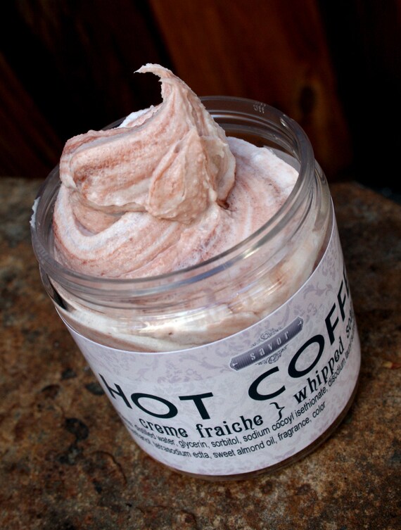
First up, notice how this soap pops in the image:

image 0
Whipped Soap VEGAN Hot Coffee 8 oz Creme Fraiche by savor

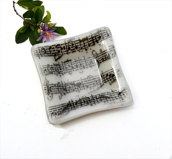
Even in a smaller size, you can clearly see the musical notes on the plate:

image 0
Fused glass art plate by Caroline4art

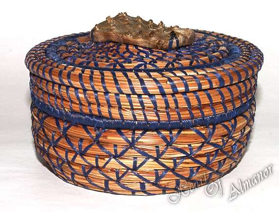
We can easily see how this piece is assembled:

image 0
lidded pine needle basket with a driftwood root top by Heart of Almanor

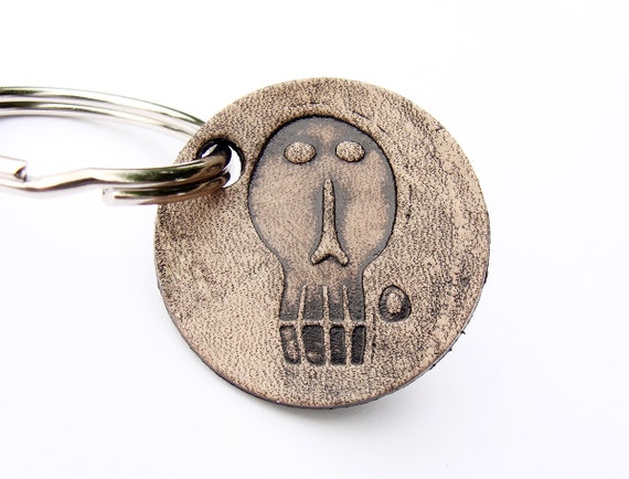
For smaller items, like keychains, it's vital that the item is clearly photographed:

image 0
Personalized Keychain Edward Gorey by Tresijas

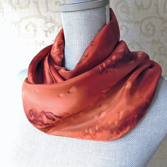
And see how clear this scarf is:

image 0
Silk Scarf Handpainted in Copper and Brown by Ocean Avenue Silks

How well focused are your pictures? How many photos do you take when photographing your items?

Tuesday, September 11, 2018

Listing Photos

Etsy allows ten photos for each listing. But do you really need ten pictures?

Selling online isn't like selling in person. Your customers can't pick up and touch your wares before purchasing. They rely on your photos to give them an idea of what they're getting.

Depending on the item, finding ten different views can be easy or hard. You want to give a good view of it. Show it in use. If it can be worn, have someone model it. Put it in context, and let customers see how small/big it is. A good closeup showing how well-made the item is will definitely help sell it.

A browser just checking out their options probably won't look at all the views of your merchandise. But a customer who is ready to buy will. That is who you want to consider when taking the photos you'll use.

But what if you can't do ten pictures of your item?

You will not be penalized for not having ten views. The live listing will look like it's meant to have five or seven photos only.

However, there are a few things you can add to the later photo slots. (You can shift the photos around, so make sure you order them in a manner that makes sense.)

Do you have other variations of the item? Do you have a gift wrapping option? Is your packaging worthy of a shot?

People, generally, are notorious for not reading through things. They ignore signs in public places. And there's a good chance they'll not carefully read your product's description. So, those final photos are a good opportunity to highlight any information you want your customers to see.

The pictures are your best way to sell your products. Give them the time and attention they need.

Thursday, September 6, 2018

Product Photos

What is more important in a listing on Etsy, the tags or the pictures?

Alas, the answer is both. They work in tandem.

If your tags aren't working, you won't be found in search. Your pictures can be amazing, but no one will ever see them.

If your pictures aren't good, you won't get much interest. Your tags might get you on the search page, but buyers are going to skim right over your items in favor of the better photos.

The good news is, you can get good at taking pictures. It just takes some practice. And there's all sorts of advice to be found online.

What does a good picture look like? It's well-lit. It's in focus. It has a background that doesn't distract from the item. (There is a debate as to whether it's better to have a blank background or not.)

Let's take a look at some good product photos:

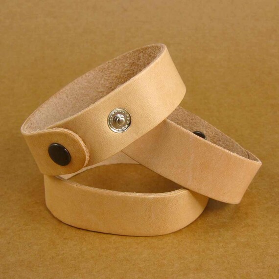
3/4 inch Blank Leather Wristbands Bracelet Cuff by Flores Tanis Supplies

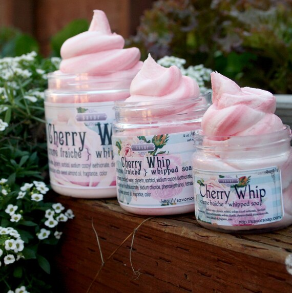
Fruity Soap Cherry Whip 2 oz by savor

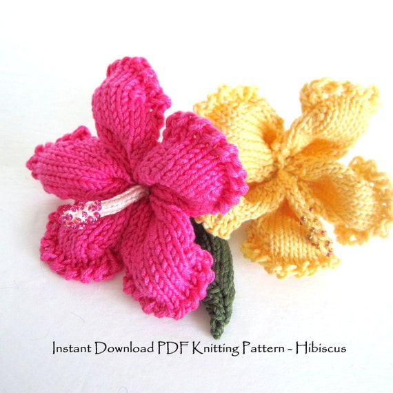
Knit Flower Instant Download PDF Pattern by ohmay

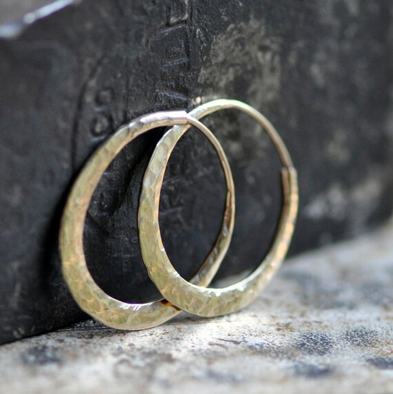
classic oval hoops in hammered 14k gold by 2 Trick Pony

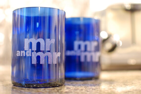
Drinking Glasses Set of 2 by Bottles & Wood

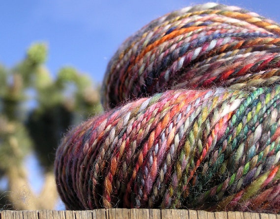
Hand Spun Yarn by Epicurius

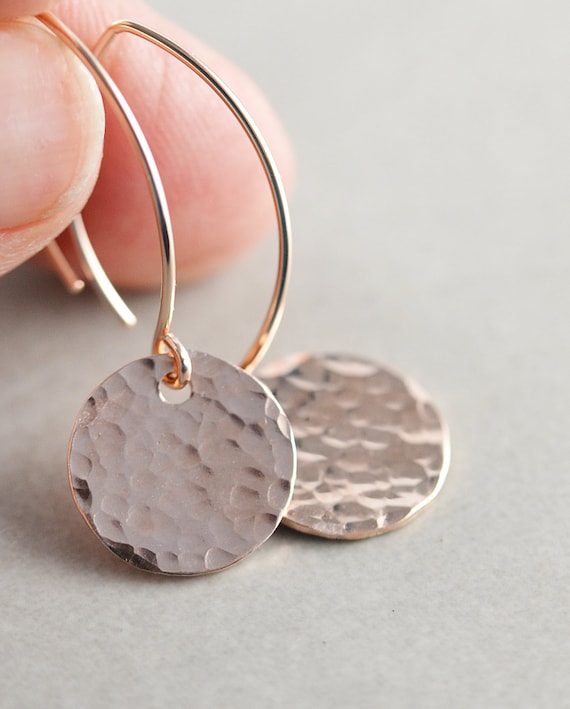
Hammered Disc Earrings by NansGlam

See how the products just jump out at you? This is the goal. And my next series of posts will delve into some tips on how to make your product photos better. 

Do you need help with photos? Do you have any advice for those of us who need it?

Tuesday, September 4, 2018

Your Product Titles: Large Ruffled Laundry Bag

Have you seen those items on Etsy with titles that are just packed with keywords? Why do people do that?

Search engine optimization.

Depending on what you read, this is either a good idea or a bad idea. It's good because the search engines "see" the tags you're targeting twice. It's bad because some search engines want more natural sounding (read: written by a human) titles.

But we can actually do both. So, why not? (I discussed this a bit before.)

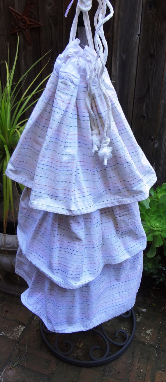
Let's take a look at this laundry bag from Vintage Encore:

Large Ruffled Laundry Bag

Some of the tags are: storage option, dorm room, nursery storage, retro bag, laundry bag, handmade laundry bag, baby laundry bag, dorm laundry bag, dorm storage, nursery laundry bag. 

(There is an opportunity here to adjust a couple of these tags, removing "laundry bag" as that's already in several other tags and adding "large ruffled" as well as the color of the laundry bag.) 

Since there are only 20 characters allowed in each tag, we're not going to hit any of those coveted long tail keywords (the keywords that someone who is pretty close to buying something is more likely to use when searching). But we can hit those in the title. And that's what we're going to try to do. 

(When researching what tags to use for an item, make note of any long tail keywords that might come up. You're going to want to aim to get those somehow in your tags and title.) 

Two other things to keep in mind. First, search engines tend to prioritize the first part of the title. Second, most search results are going to cut off the title after so many characters. So, we're going to want to focus on keeping the first 40-50 characters sounding like a human wrote it and using the keywords most likely to be what people are searching for. 

There are 140 maximum characters for this title. How can we title this? 

Let's start with Large Ruffled White Laundry Bag (31 characters). Including the color is kind of a gamble. Some people are specifically searching for color. If we want an exact match, we could put the "white" first or last ("in white"). Exact matches are going to rank higher, but the more words you match, the better.

Then we can combine two of those tags that sound natural together: Dorm Room Storage Option (24 characters). Or: Retro Bag Dorm Storage (22 characters). Notice how those sound like a description of the item. That's what we're going for. 

All three of those sequences contain 79 characters. We still have 61 characters to use. But towards the end of the title, we can kind of jam in the rest of the tags as no person is really going to read that far. Only the machines... 

So, this title looks like (at the moment): Large Ruffled White Laundry Bag * Dorm Room Storage Option * Retro Bag Dorm Storage *... 

Wait, do we need to put those *s in there? Actually, it's better if you don't. The search engines will look for exact matches (to rank higher), so if someone searches "white laundry bag dorm room storage", that * will take away the exact match. (Although, it'll still match. It'll just match with a lower rank.) And we've lost 2 characters per * (the * and the space after it). 

It's kind of a puzzle that you're constructing from the tags you already have. (Yes, write your title after you're already selected your 13 tags.) 

How are your item titles?